Monday, August 20, 2018

Include or Exclude Columns in an Interactive Report Export

You might have noticed that for the Classic Reports and the Interactive Grids there's an option to include or exclude a column in the report's export.


Unfortunately, that option is not available for the Interactive Reports.

In order to export a report, APEX submits the page using a request that is then used to generate the corresponding file. This can be verified by having a look at the network tab in DevTools:

As we can see, a request is used to export the report, except for the Email option.

If we look at the request's details for the Email export:

We can see that it's making an AJAX call and that it sets the p_widget_action to "SEND_EMAIL" which is saved in the wwv_flow package as g_widget_action.

Using the above, we can remove a column from the export by adding a server-side condition that checks the request and the widget action as follow:

nvl(:request, 'EMPTY') not in ('CSV','XLS','PDF','RTF','HTMLD')
and nvl(wwv_flow.g_widget_action, 'EMPTY') <> 'SEND_EMAIL'

That condition will work if there is only one interactive report on the page. If there is more than one report, the requests will be different.

As we can see here:

The requests are going to be using this pattern:
IR[R<region id>]_<export type>

If we take that into consideration and include it into the previous condition, we will have this:

nvl(substr(:request, instr(:request, '_', -1) + 1), 'EMPTY') not in ('CSV','XLS','PDF','RTF','HTMLD')
and nvl(wwv_flow.g_widget_action, 'EMPTY') <> 'SEND_EMAIL'

In order to centralize the condition and avoid code being duplicated/replicated everywhere that we need to use this, it's best to create an authorization schema that we can use instead of using the server-side condition.

Enjoy!

Friday, May 18, 2018

Lazy Loading Report

I was recently asked to have a look at an APEX page that took some time to load. That particular page was accessed using the navigation menu. Since the load time was longer than usual, users were often clicking multiple times on it while waiting.

As usual, I turned debug mode on and had a look at the result. It turned out to be the underlying query of the page's report that was slow.

We were able to fine-tune the query to make everything load faster. But it still took a couple of seconds to render.

What I did was to make the report lazy load the data, similar to what the Interactive Grid can do.

The idea is the following
  1. Create a hidden item on the page
  2. Create a computation using the "After Regions" point to set the item to 'Y'
  3. In the report, add a where clause that checks if the item's value is equal to 'Y'
  4. Create a dynamic action on page load that refreshes the report
What this is doing is that when the report is being rendered for the first time, the calculation has not been executed and the item is still null so that the report will show nothing.
Then, the calculation will be executed and the dynamic actions will refresh the report showing the expected results.

Don't get me wrong here, the overall process is still going to take the exact same time.
If the page is taking 10 seconds to load, it will still take 10 seconds for the page to fully load.
But, the user experience is going to be a lot better because now the page will load instantaneously, then the report will take some time to load while displaying the processing icon.

Here's what the query would look like
select /* your columns */
  from /* your tables */
 where 1 = 1 
   and nvl(:P1_IS_LOADED, 'N') = 'Y'

If you also need to be able to download the report, you'll need to add another condition so that it can work:
select /* your columns */
  from /* your tables */
 where 1 = 1 
   and ( /* Standard Page Load */
         nvl(:P1_IS_LOADED, 'N') = 'Y'
         
         /* Report Download */
         or substr(:request, instr(:request, '_', -1) + 1) in ('CSV','XLS','PDF','RTF','HTMLD')
         
         /* Report Email */
         or wwv_flow.g_widget_action = 'SEND_EMAIL'
         )

For more information about the above condition, you can have a look here.

Here's what the end result looks like compared to the standard behaviour:


You can have a look at it in action in my Demo Application

Enjoy!

Friday, March 2, 2018

APEX 5.2 Page Designer Style for APEX 5.1

Have you been playing, trying and testing stuff on the Early Adapter of APEX 5.2.
If you haven't, it's still available (as of writing this) for you to try at apexea.oracle.com.

If you have, you probably noticed that the user interface of the page designer was refined and is looking better than ever.

APEX 5.2 Page Designer:

APEX 5.1 Page Designer:


After a while, you'll get use to the new look of the page designer and going back to 5.1 might feel weird.

Wouldn't it be nice if we could have the same look and feel on APEX 5.1.

We can actually achieve that and it's not that difficult.

The following is relying on CSS only, no JavaScript required. So there's no risk of breaking the page designer or any of its functionalities.

So how can we do it?

There's a super useful extension I used: Stylish
It's available on Chrome, Firefox and Opera.

What it does is inject CSS for whatever website your tell it to.

How to set everything up:
Step 1. Install the extension

Step 2. Create a new style

Step 3. Copy and paste the following code
/*-------------------------------------
 * APEX 18.1 Page Designer Style for APEX 5.1
 * Version: 1.1 (2018-03-16)
 * Author:  Maxime Tremblay
 *
 * https://max-tremblay.blogspot.ca/2018/03/apex-52-page-designer-style-for-apex-51.html
 *
 * To be used with the Stylish Addon: https://userstyles.org/
 *  - Chrome:  https://chrome.google.com/webstore/detail/stylish-custom-themes-for/fjnbnpbmkenffdnngjfgmeleoegfcffe
 *  - Firefox: https://addons.mozilla.org/en-US/firefox/addon/stylish/
 *  - Opera:   https://addons.opera.com/en-gb/extensions/details/stylish/
 *
 * Use with regexp URL: https?://(?:(?!apexea.oracle.com).)*f\?p=4000:4500.*
 * or any other URL you wish
 *
 * Using Gist: https://gist.github.com/maxime-tremblay/59c46c9f441801b6de0c88f72d0d63d9
 * Served using: https://rawgit.com/
 *
 *-------------------------------------
 */

/* You can use the rawgit URL or copy everything from the Gist */
@import url('https://rawgit.com/maxime-tremblay/59c46c9f441801b6de0c88f72d0d63d9/raw/aa9877dad692317aa676b63911b6366631ee772d/APEX18.1-Page_Designer_for_APEX5.1.css');

Step 4. Define what website it should be applied to.

Since I'm working with APEX 5.1 everywhere, I'm using the regular expression  https?://(?:(?!apexea.oracle.com).)*f\?p=4000:4500.* to apply it everywhere except apexea.oracle.com.


Here's the end result:

Of course not everything is the exact same. Everything that relies on new CSS classes or anything new will obviously not be replicated.

Here's a list of small differences
  • Never element are not strikethrough
  • Elements with unsaved changes don't have the left border highlight
  • The property editor header is looking differently (buttons removed in 5.2 and search filter moved).

I've been using this for a couple of weeks now and I have to say that I really love it.

Enjoy!

Thursday, March 1, 2018

Datepicker Customization

Back in 2010, the Oracle Application Express release 4.0 included the jQuery JavaScript library as well as the jQuery UI JavaScript library. With it came the new revision of the datepicker item based on the jQuery UI's widget as we have it today. Most of the widget's options are available to us as item attributes.
But, there might come a time when you get asked or need to change some option that is not available.

Maybe you need to change the first day of the week to Monday instead of Sunday, or need to disable some days, etc.

For a list of all available options and the utility functions, you should have a look at the Datepicker Widget API Documentation.

There are a couple of nice hidden features that you might not know existed.
Let's have a look at a couple of them.

Changing the first day of the week to Mondays
$('#P1000_DATE_3').datepicker("option", "firstDay", 1);

Disabling the selection of weekends using built-in utility function.
$('#P1000_DATE_4').datepicker("option", "beforeShowDay", $.datepicker.noWeekends);

Disabling the selection of Mondays
function disableMondays(pDate){
    var lTooltipDate = "Tooltip for disabled dates";
    if (pDate.getDay() === 1) {
        return [false, 'disabledDayClass', lTooltipDate];
    }
    else {
        return [true, null, null];
    }
}

$('#P1000_DATE_5').datepicker("option", "beforeShowDay", function(date) {return disableMondays(date);});

However, if you change an option for a datepicker item, you'll notice that the icon trigger will look different.


So what's going on exactly?
Let's have a look at the html.

Before changing an option:
<input type="text" class="datepicker apex-item-text apex-item-datepicker hasDatepicker" id="P1000_DATE_1" name="P1000_DATE_1" maxlength="" size="30" value="" autocomplete="off">
<button type="button" class="ui-datepicker-trigger a-Button a-Button--calendar">
    <span class="a-Icon icon-calendar"></span>
    <span class="u-VisuallyHidden">Popup Calendar: Date<span></span></span>
</button>

After changing an option:
<input type="text" class="datepicker apex-item-text apex-item-datepicker hasDatepicker" id="P1000_DATE_1" name="P1000_DATE_1" maxlength="" size="30" value="" autocomplete="off">
<button type="button" class="ui-datepicker-trigger">
    <span class="a-Icon icon-calendar"></span>
    <span class="u-VisuallyHidden">Popup Calendar: Date<span></span></span>
</button>


We can see that the button element is missing two APEX classes after an option is changed:
a-Button a-Button--calendar

So, to fix the issue with the button trigger we simply need to add the classes back.
That's also exactly what APEX is doing on page load for each datepicker item.
(function() {
    apex.widget.datepicker("#P1000_DATE_1", {
        "buttonImageOnly": false,
        "buttonText": "\u003Cspan class=\u0022a-Icon icon-calendar\u0022\u003E\u003C\u002Fspan\u003E\u003Cspan class=\u0022u-VisuallyHidden\u0022\u003EPopup Calendar: Date\u003Cspan\u003E",
        "showTime": false,
        "defaultDate": new Date(2018, 1, 26, 20, 32, 47),
        "showOn": "button",
        "showOtherMonths": false,
        "changeMonth": false,
        "changeYear": false
    }, "dd-M-y", "en");
    apex.jQuery('#P1000_DATE_1').next('button').addClass('a-Button a-Button--calendar');
})();

Having a look again at our first example (changing the first day of the week to Mondays). We should use something like this.
$('#P1000_DATE_3').datepicker("option", "firstDay", 1).next('button').addClass('a-Button a-Button--calendar');
Now, what if you would like to change an option for every datepicker in your application.

Once a datepicker is initialized a "hasDatepicker" class is added to the element. So instead of using the item ID as the jQuery selector, we could use that class and have the code execute on page load.
$('.hasDatepicker').datepicker("option", "firstDay", 1).next('button').addClass('a-Button a-Button--calendar');

If the previous code is not working as expected, it my be due to a timing issue. Since the code to customize the datepicker items is executed on page load and that the dapicker are initialized on page load also. The customizing code could be running before the actual initialization. To fix that you can add a short delay to it.

You can have a look at it in action in my Demo Application

Enjoy!

Saturday, February 10, 2018

Switch and Radio as Pill Custom Colors

There are two easy ways to have Toggle-like items in your applications.

One way is by using the Switch item type that will like this:

If your switch items are displayed as select lists rather than as toggle items, you will need to go in your application's Shared Components, then in the Components Settings and edit the Switch item to change the Display Style attribute to Switch.

Another way is by using a Radio item. You'll need to change some attributes so that the item is displayed as a toggle.

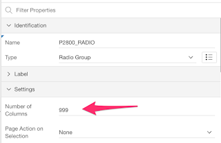
First, you'll need to change the Number of Columns attributes to at least the amount of values you have. I like to use 999 so that if a new value is added to the list, I won't have to change the attribute again.

Then you'll need to change the Template Options so that the Radio Group Display is set to "Display as Pill Button".
You will get a radio item that looks like this:

Now, let's customize their colors.

Custom On/Off Colors

Let's define this CSS
/* Custom On/Off Color - No Color */
.t-Form-fieldContainer--radioButtonGroup .customOnOffColor.apex-item-radio input:checked + label,
.customOnOffColor.apex-button-group input:checked+label {
    background-color: #EF9A9A;
}

/* Custom On/Off Color - Yes Color */
.t-Form-fieldContainer--radioButtonGroup .customOnOffColor.apex-item-radio input[value=Y]:checked + label,
.customOnOffColor.apex-button-group input[value=Y]:checked+label {
    background-color:#A5D6A7
}
In order to have the items use custom colors, we only need to set the CSS Classes to "customOnOffColor".

The yes value will be green and any other value will be red, like this:

Custom On Color

Let's define this CSS
/* Custom On Color */
.t-Form-fieldContainer--radioButtonGroup .customOnColor.apex-item-radio input:checked + label,
.customOnColor.apex-button-group input:checked+label {
    background-color: #B3E5FC;
}
In order to have the items use custom color, we only need to set the CSS Classes to "customOnColor".

The selected value will be blue, like this:


For both the custom On/Off and On only colors, if you'd like to apply it for all items (Switch and Radio as Pill), you can simply remove the classes names from the above CSS.

You can have a look at it in action in my Demo Application

Enjoy!

Monday, January 29, 2018

Use Font APEX and Font Awesome Simultaneously

APEX 5.0 gave us the ability to include the Font Awesome library in our applications. In APEX 5.1, Font APEX was added the the list of icon library. 

Taken from the Universal Theme Sample Application:
Font APEX is an all new icon library designed to complement Universal Theme. It was designed as a replacement for Font Awesome, the web's leading icon library, and therefore contains almost all of the Font Awesome icons, re-drawn on a 16x16 grid as line-icons, to match the aesthetic we wanted. We wanted to make it a seamless switch to go from Font Awesome to Font APEX, and therefore use the same "fa" prefix for the icons, making it easier than ever to move to entirely new icon library.
To include either Font Awesome or Font APEX in our application, we need to go under the application's Shared Components, then under Themes, select the theme and under the Icons section, we can select the library that we want to include.

What if we would, for some reason, like to include the two libraries and use some icons from one and some icons from the other.

Unfortunately, the library attribute only enables us to select one of them.

On top of that, since the two libraries are using the same "fa" prefix, we can't simply include both files.

On the other hand, Font Awesome includes the LESS and Sass files so that we can customize and build the library ourselves.

What we'll do

The idea is to include the Font APEX library using the built-in attributes. We'll then need to customize Font Awesome so that it uses a different prefix, build it and include that custom version into our application.

Building our customized Font Awesome

First, we'll need to head over to http://fontawesome.io and download the library.
Once extracted, we get 4 folders:
  • css
  • fonts
  • less 
  • scss
Looking at either the LESS or Sass folder we'll see the different files required to build the library. You can choose whichever one you're most familiar with.

For what we're trying to achieve, we can focus specifically on the "variables" and the "font-awesome" files.

The variables file allows us to replace the "fa-css-prefix" variable.
By default, it's set to "fa", but let's change it to something different like "fawe".

Then, we can build the customized version of the library using the "font-awesome" file.

You can build LESS and Sass files with most text editors. There are also many desktop applications that are able to compile LESS and Sass.


Once our customized Font Awesome is built, we need to upload it to our application (either in the Static Files or on your Web Server).

Using Font APEX and Font Awesome

First, we'll need to include our custom Font Awesome library. We can add it under the Shared Components by going into the User Interface Attributes and then selecting the Desktop interface. Under the Cascading Style Sheets Section, we can add the references to our file.

Something like this:
#APP_IMAGES#font-awesome/4.7.0/css/custom-font-awesome#MIN#.css

Using Font APEX will be just as usual. Use the corresponding "fa" class as seen on
<i class="fa fa-cog" aria-hidden="true"></i>
<i class="fa fa-trash-o" aria-hidden="true"></i>
<i class="fa fa-bars" aria-hidden="true"></i>
<i class="fa fa-envelope-o" aria-hidden="true"></i>
<i class="fa fa-key" aria-hidden="true"></i>
<i class="fa fa-shopping-cart" aria-hidden="true"></i>
<i class="fa fa-battery-half" aria-hidden="true"></i>

In order to use our customized Font Awesome, we will need to use our custom class prefix. In our case: "fawe".
<i class="fawe fawe-cog" aria-hidden="true"></i>
<i class="fawe fawe-trash-o" aria-hidden="true"></i>
<i class="fawe fawe-bars" aria-hidden="true"></i>
<i class="fawe fawe-envelope-o" aria-hidden="true"></i>
<i class="fawe fawe-key" aria-hidden="true"></i>
<i class="fawe fawe-shopping-cart" aria-hidden="true"></i>
<i class="fawe fawe-battery-half" aria-hidden="true"></i>
You'll then be able to use both at the same time, like this:


You can have a look at it in action in my Demo Application

You can also get the custom Font Awesome library: here

Enjoy!

Wednesday, January 17, 2018

Custom Confirm Dialog Button Labels

Some time ago, someone on the apex.world Slack channel asked a question about the APEX confirm dialog. The question was if it was possible to change the labels of the confirm dialog buttons from "Cancel/Ok" to "No/Yes".

If we look at the JavaScript APIs documentation we can see that there are three different ways that we can display a confirmation dialog:
  • apex.confirm
  • apex.page.confirm
  • apex.message.confirm
Note
The confirm function from the page namespace is different from the one in the confirm namespace. They both render the same confirmation dialog though.

apex.confirm: Alias for the apex.page.confirm function.

apex.page.confirm: Displays a confirmation dialog showing a message (pMessage) and OK and Cancel buttons. Depending on the user's choice, submits the page setting the request value to pRequest, or does not submit the page.

apex.message.confirm: Displays a confirmation dialog showing a message (pMessage), and OK and Cancel buttons. The callback function passed as the pCallback parameter is called when the dialog is closed, and passes true if OK is pressed and false otherwise.

The following JavaScript code:
apex.message.confirm( "Are you sure?", function( okPressed ) {
    console.log(okPressed ? 'Ok' : 'Cancel');
});

Would display this dialog:


Now, back to the original question. What if we would like to change those button labels.

If we have a look at the JavaScript code of the apex.message.confirm function, we can see that the labels are based on some apex.lang messages (APEX.DIALOG.OK and APEX.DIALOG.CANCEL) and that there is no built-in way to change the labels.

But...

What we can do is change the values (using the JavaScript API of the apex.lang namespace) of the two messages and then call the confirm function. We should also revert the changes to the messages after that so that everything remains as it was initially.

Ok, so let's create a wrapper function on apex.message.confirm (the same also works for apex.page.confirm)  and add two parameters for the button labels.

The function could look like this:
function customConfirm( pMessage, pCallback, pOkLabel, pCancelLabel ){
    var l_original_messages = {"APEX.DIALOG.OK":     apex.lang.getMessage("APEX.DIALOG.OK"),
                               "APEX.DIALOG.CANCEL": apex.lang.getMessage("APEX.DIALOG.CANCEL")};

    //change the button labels messages
    apex.lang.addMessages({"APEX.DIALOG.OK":     pOkLabel});
    apex.lang.addMessages({"APEX.DIALOG.CANCEL": pCancelLabel});

    //show the confirm dialog
    apex.message.confirm(pMessage, pCallback);

    //changes the button labels messages back to their original values
    apex.lang.addMessages({"APEX.DIALOG.OK":     l_original_messages["APEX.DIALOG.OK"]});
    apex.lang.addMessages({"APEX.DIALOG.CANCEL": l_original_messages["APEX.DIALOG.CANCEL"]});
}

Then, calling our function:
customConfirm( "Are you sure?", function( okPressed ) {
    console.log(okPressed ? 'Ok' : 'Cancel');
}, "Yes", "No");

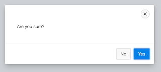
Would result in this:

or anything you want, like this:

You can have a look at it in action in my Demo Application

Enjoy!