One way is by using the Switch item type that will like this:
If your switch items are displayed as select lists rather than as toggle items, you will need to go in your application's Shared Components, then in the Components Settings and edit the Switch item to change the Display Style attribute to Switch.
Another way is by using a Radio item. You'll need to change some attributes so that the item is displayed as a toggle.
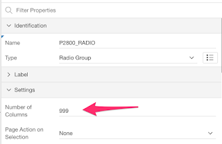
First, you'll need to change the Number of Columns attributes to at least the amount of values you have. I like to use 999 so that if a new value is added to the list, I won't have to change the attribute again.
Then you'll need to change the Template Options so that the Radio Group Display is set to "Display as Pill Button".
You will get a radio item that looks like this:
Now, let's customize their colors.
Custom On/Off Colors
Let's define this CSSIn order to have the items use custom colors, we only need to set the CSS Classes to "customOnOffColor"./* Custom On/Off Color - No Color */ .t-Form-fieldContainer--radioButtonGroup .customOnOffColor.apex-item-radio input:checked + label, .customOnOffColor.apex-button-group input:checked+label { background-color: #EF9A9A; } /* Custom On/Off Color - Yes Color */ .t-Form-fieldContainer--radioButtonGroup .customOnOffColor.apex-item-radio input[value=Y]:checked + label, .customOnOffColor.apex-button-group input[value=Y]:checked+label { background-color:#A5D6A7 }
The yes value will be green and any other value will be red, like this:
Custom On Color
Let's define this CSSIn order to have the items use custom color, we only need to set the CSS Classes to "customOnColor"./* Custom On Color */ .t-Form-fieldContainer--radioButtonGroup .customOnColor.apex-item-radio input:checked + label, .customOnColor.apex-button-group input:checked+label { background-color: #B3E5FC; }
The selected value will be blue, like this:
For both the custom On/Off and On only colors, if you'd like to apply it for all items (Switch and Radio as Pill), you can simply remove the classes names from the above CSS.
You can have a look at it in action in my Demo Application
Enjoy!


